HackerRank’s Virtual Career Fair
INTRODUCTION
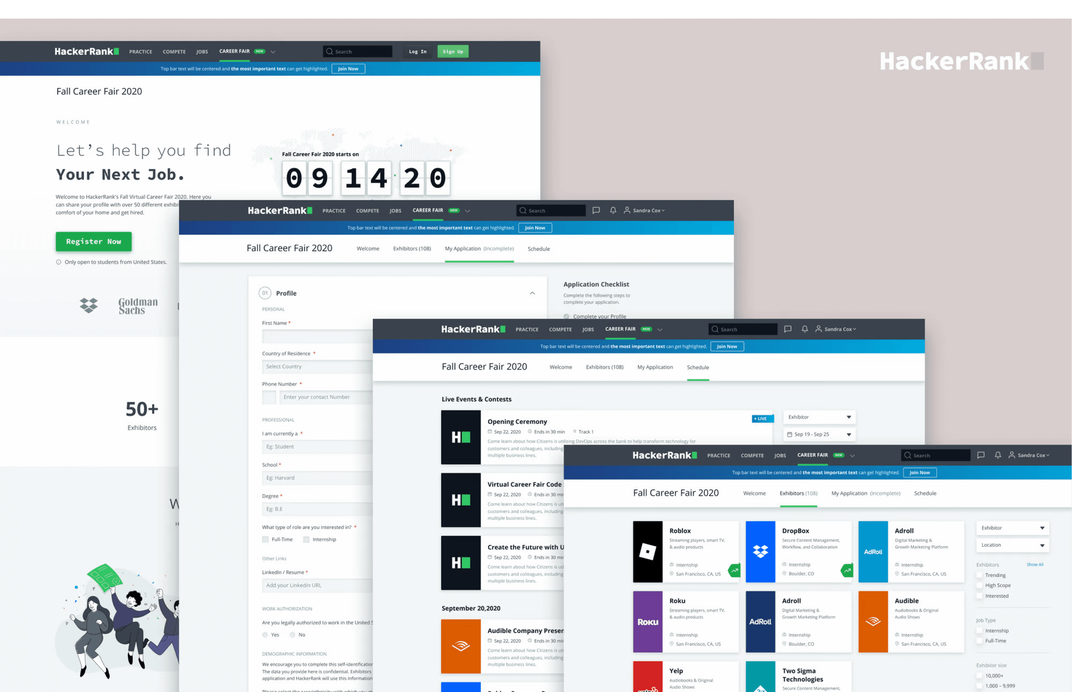
HackerRank’s First Virtual career fair is a remote university recruiting event where students from across the United States can connect with potential employers.
MY ROLE
I contributed to the overall design process to build virtual career fair. I conducted market and user research, designed, prototyped and tested the feature.
PROJECT SCOPE
4 Months : Jun 2020 - Sep 2020
TEAM
1 Product Managers, Product Designer, Team of Engineers
THE PROBLEM
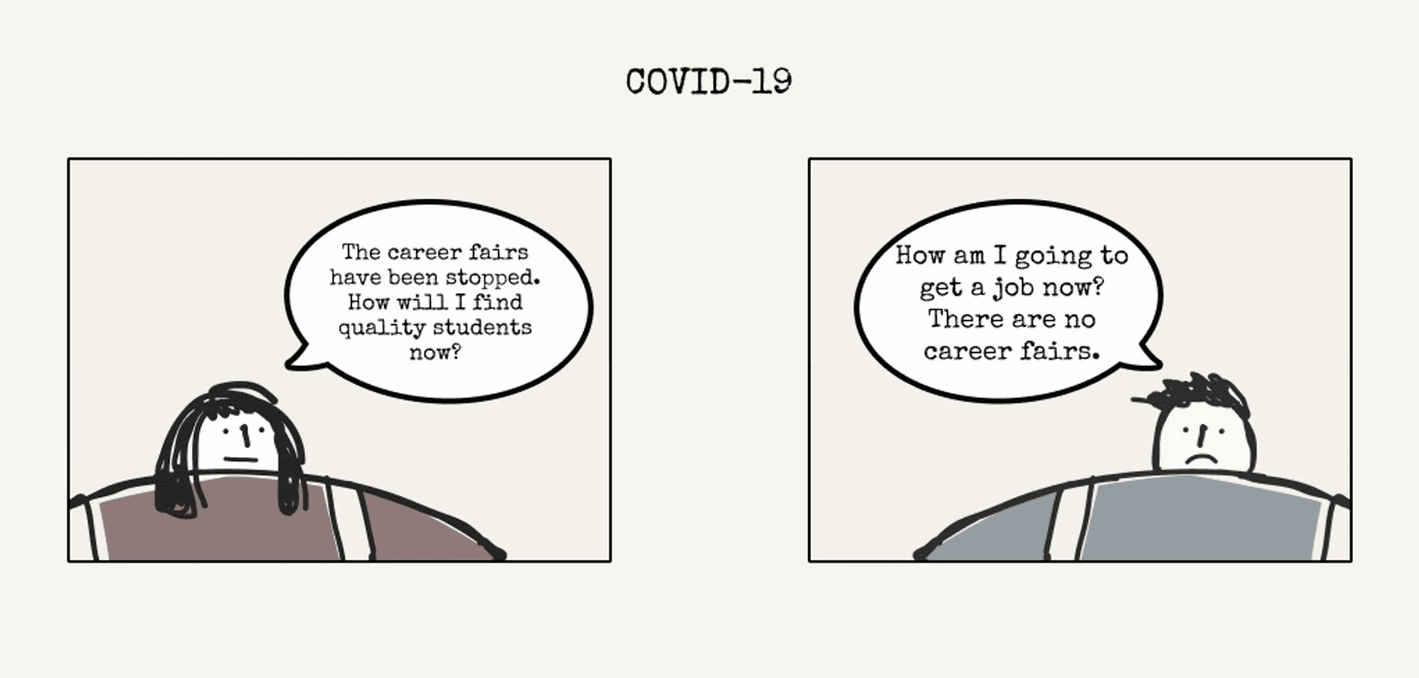
Historically, 400,000+ student developers and 1,200+ schools have relied on in-person career fairs to find internships and full-time jobs every year (Data from National Center for Education Statistics). But given the impact of COVID-19, in-person career fairs around the country have been forced to cancel to enact social distancing.
How can a platform supersede the traditional career fairs to tackle COVID-19 and other problems?
The Process
LEARNING MORE
We dug deep into the problem and apprehended that there was a bigger problem at hand than just COVID-19.
For both employers and job seekers, traditional career fairs are artificially limiting: restrictions around budget, travel availability and time mean that only a fraction of available job seekers and employers are able to connect successfully.
While first impressions at a career fair are often based purely on resumes, we wanted to leverage data from the HackerRank platform to create a skill-based experience.
UNDERSTANDING THE USERS
Most of the people at a career fair fall into two categories.
Job Seekers
Employers
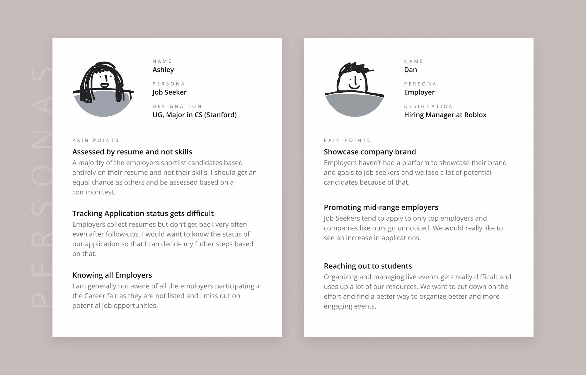
We interviewed both of them to learn more about traditional job fairs and figure out a way to make an online version of these career fairs. Their wants and problems helped us figure out better what we should be building.
PRODUCT GOAL
How might we design a platform that replaces the existing career fairs?
Job Seeker Needs:
Have a competition during the Fair's time to give everyone an equal shot at getting hired.
Information on the company: Location, compensation, role description etc.
Employer Needs:
Showcase their brands
Live events to interact with students.
Track applicants and interview them.
Solutioning
FEATURE PRIORITIZATION
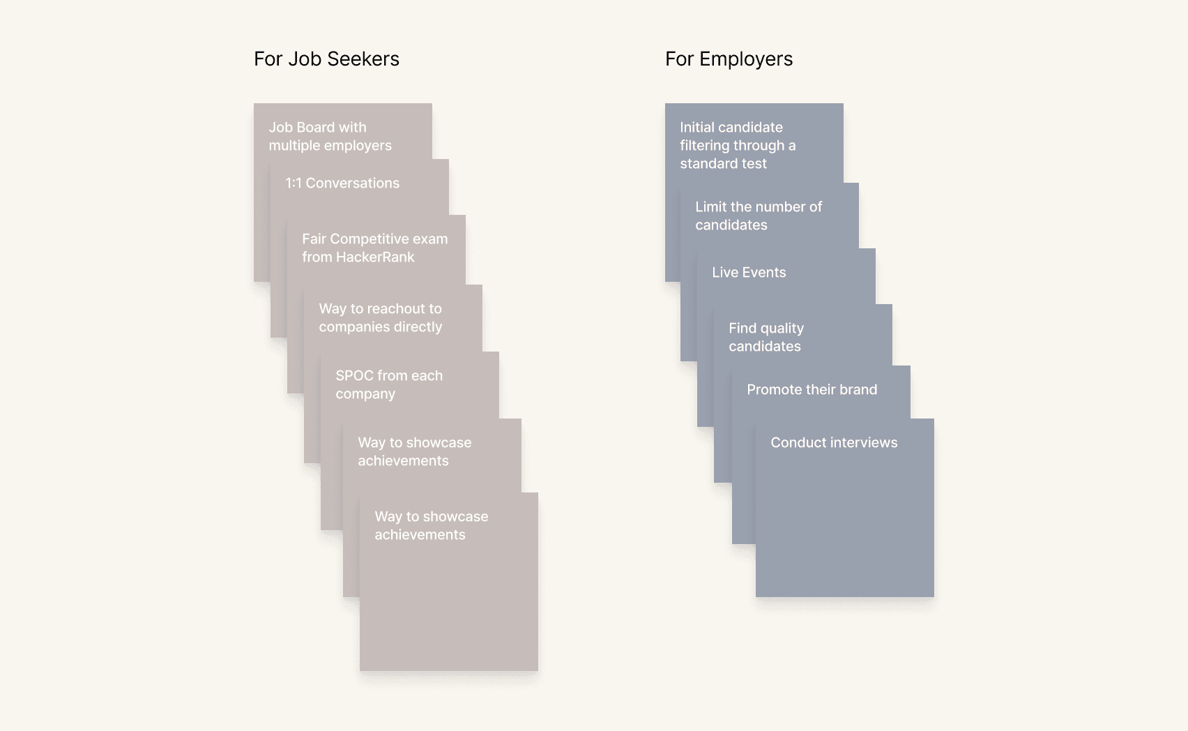
We had a lot of ideas from our brainstorming sessions, so we had to decide which features were must-haves and which ones were nice-to-haves. After the prioritisation, we could see where we were going with this project.
USER FLOW
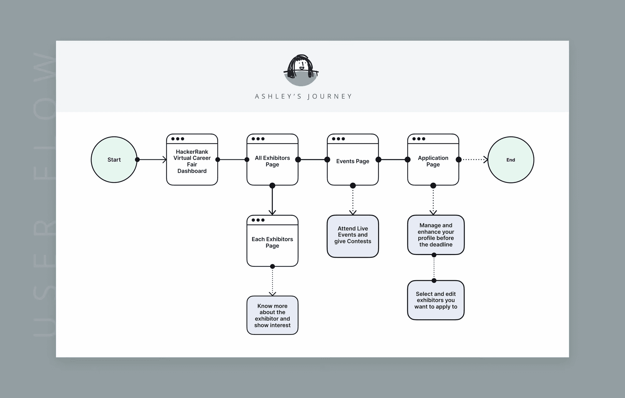
Once we decided which features were most important, we put together the main user flow for both personas. The goal was to make the experience feel a lot like what people do at real-life career fairs, so the features were put in those specific journeys.
WIREFRAMES
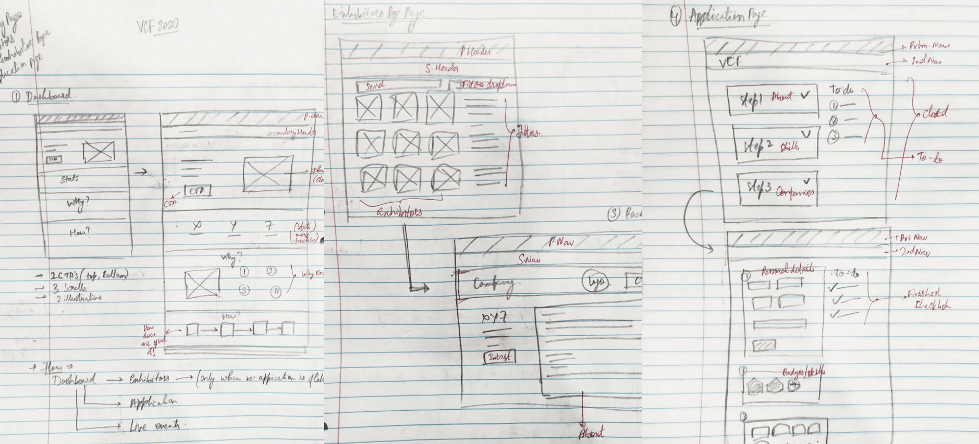
Based on the user flow and the information architecture, ee sketched out some concepts for the pages. The sketches helped us understand the idea better and we could hence receive some early feedback.
Designs
DELIVERABLES
The final deliverables of the project were:
User flows.
High fidelity mockups for all the features & pages.
Micro-interactions and prototype.
for both web and mobile screens.
LANDING PAGE
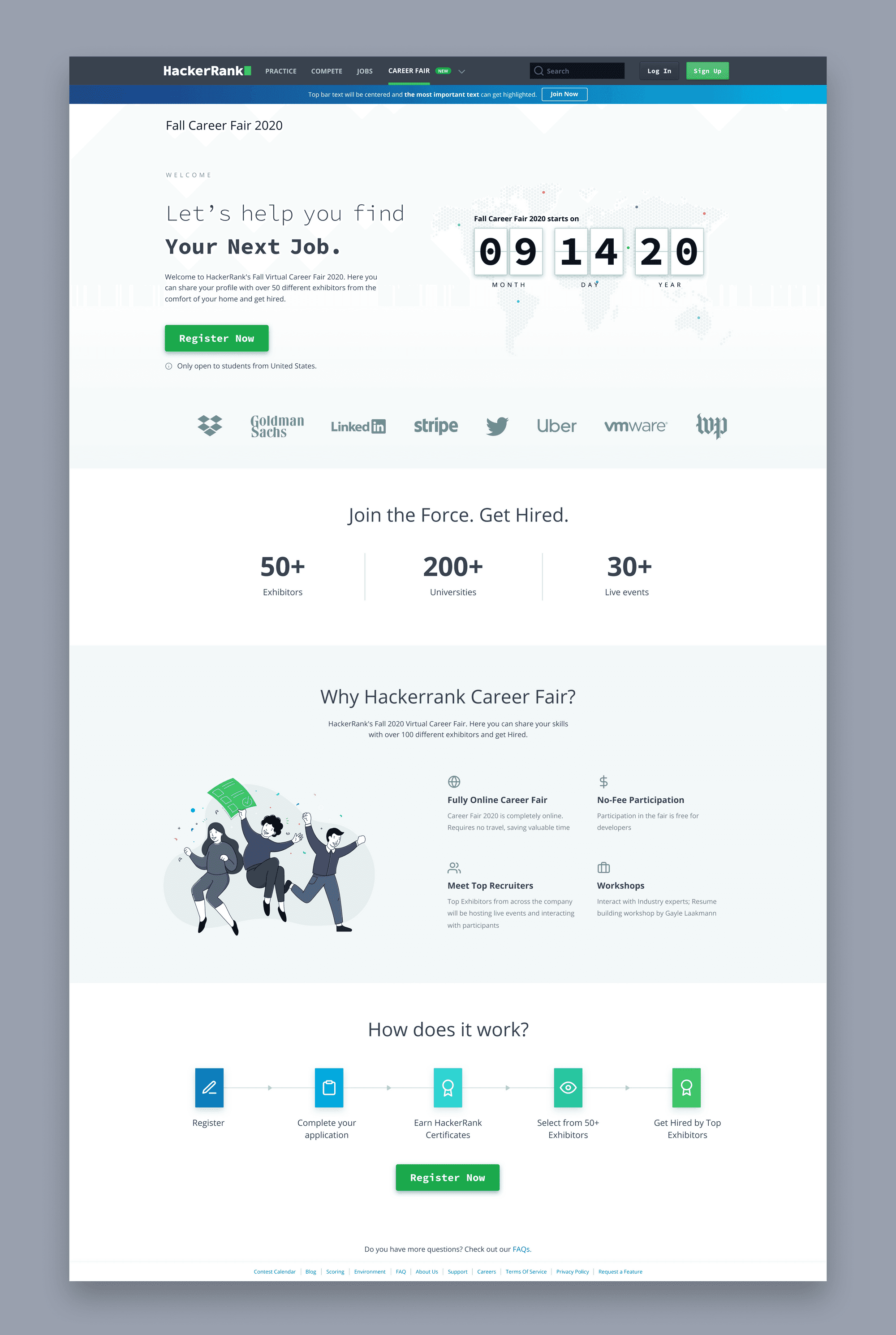
Landing page for the career fair explaining how it works and what the next steps of a candidate are.
EXHIBITORS PAGE
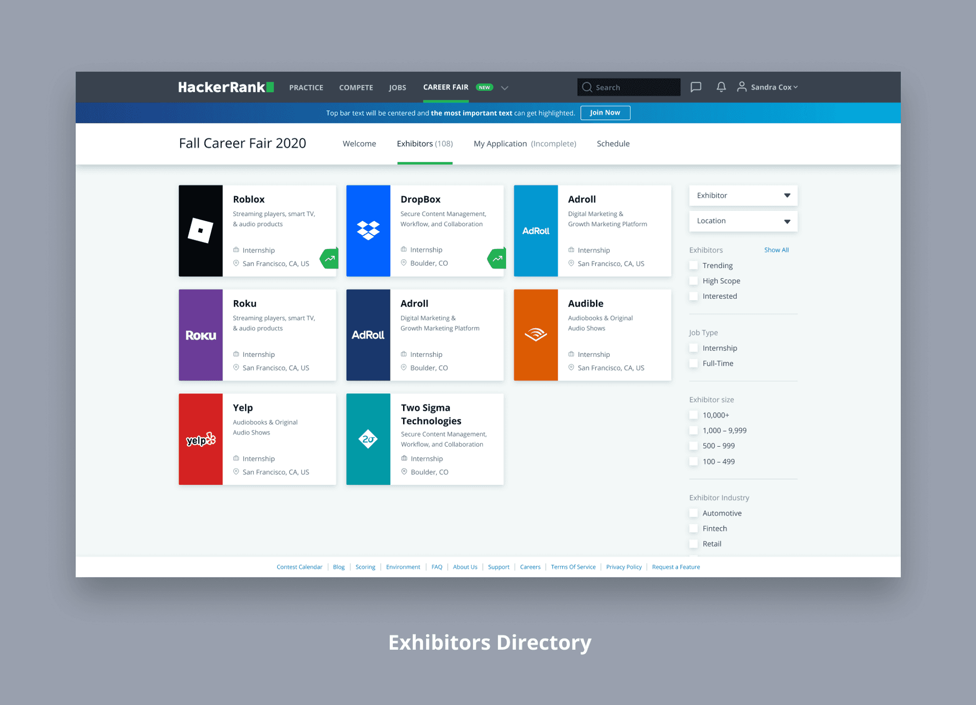
Directory of all the companies participating in the virtual career fair. Each company has a specific page with more information about the company and the open roles.
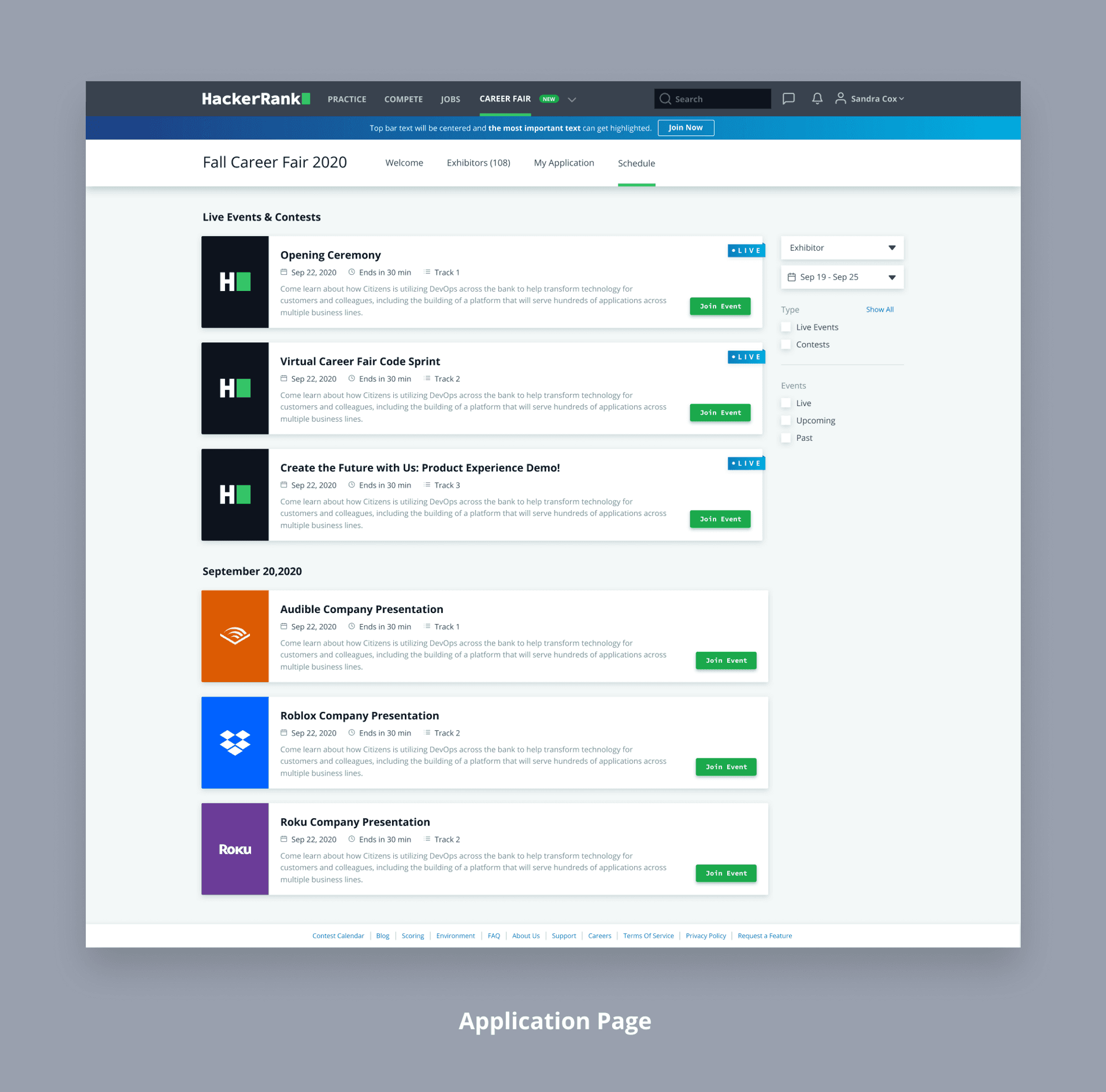
SCHEDULE PAGE
A list of all the events scheduled during the career fair. The events are sorted day wise to keep track of everything happening on a certain day.
A little more..
INSIGHTS
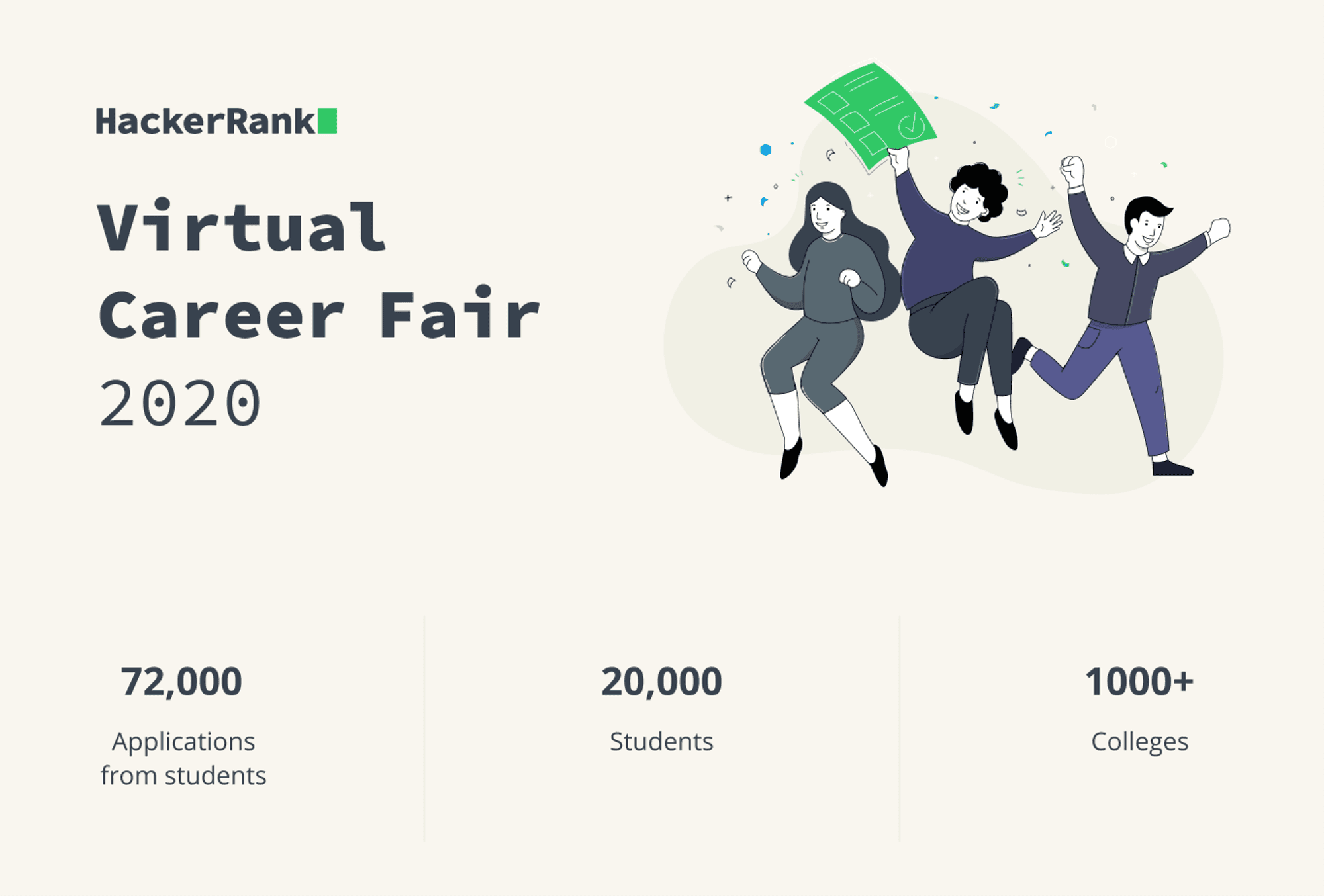
We ended the fair with 20,000 signups from 1000+ schools. 8,000 of these students sent in at least one application for a total of 72,000 applications submitted.
CHALLENGES
I had to find solutions to a lot of interesting challenges. Some visual, and some on the flow and experience. Some of the ones I faced were:
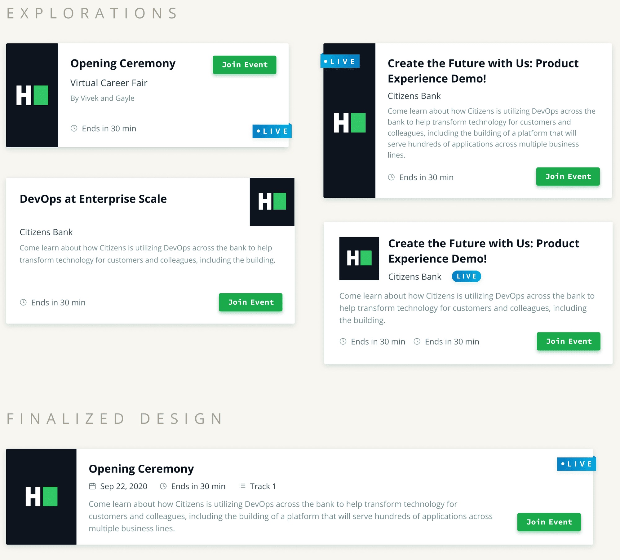
Designing cards with changing text is a difficult job. Considering the perfect use case breaks your design when the worst-case arises. Designing for the worst case first helped me get this right.
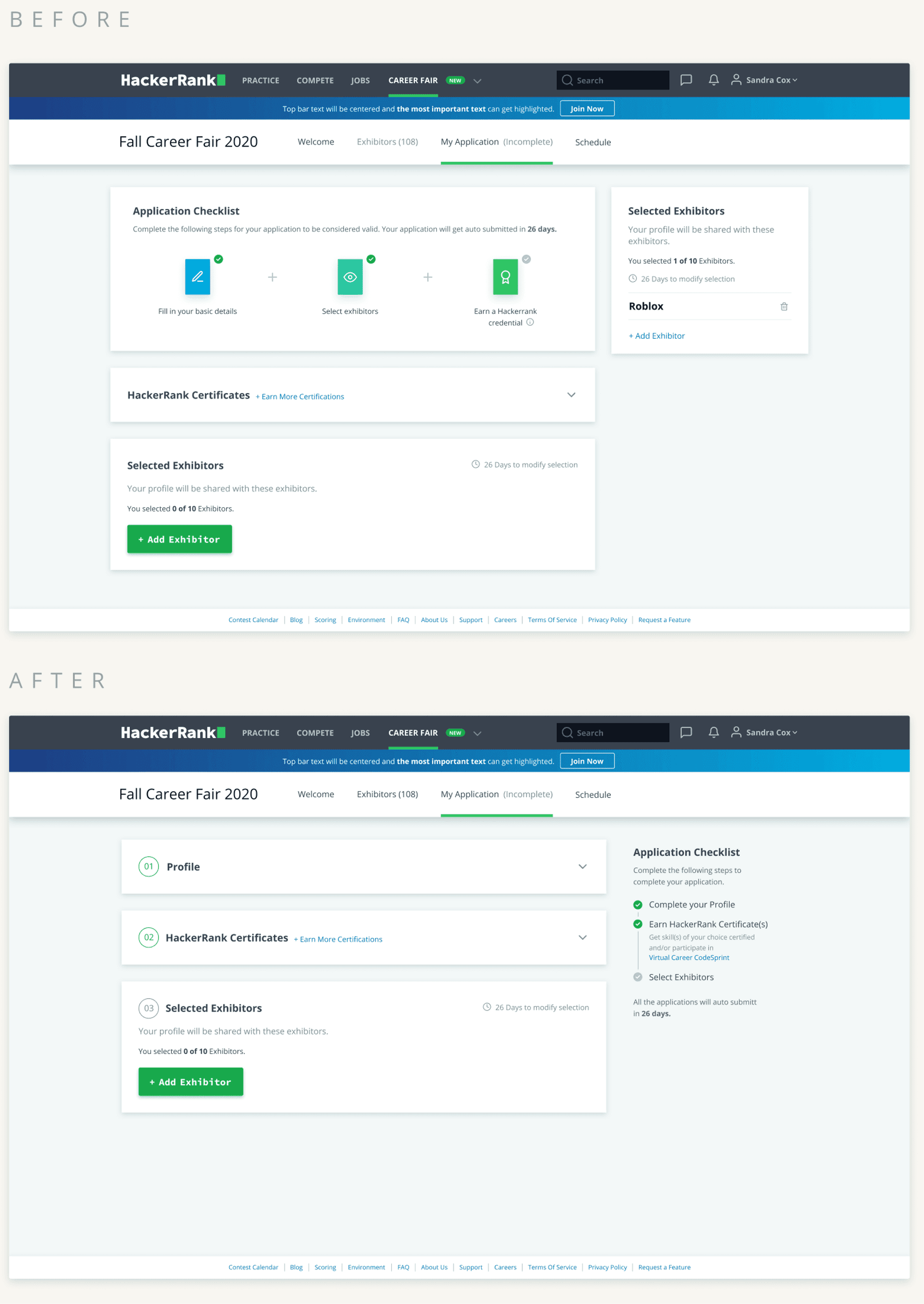
I had positioned the checklist of an application on the top, thinking it would be most visible there. To do this, I had to push another section of the application to the right. After testing, we knew that people took the checklist to be actionable.
Use the law of common-region when you are designing a screen with elements on the same level. When you put similar things together, they appear to be in a group, and our brains tend to think that they have the same action/purpose.
DESIGN LEARNINGS
This was my first big end-to-end project. I learnt a lot about design and processes, and here are a few of my learnings.
Most of them are already known but experiencing them for the first time was different.
Spend a lot of time researching and sketching instead of directly bouncing on to the hi-fidelity mockups to reduce the number of re-iterations and effort.
Not everything you design can get developed. Always check how feasible the design is with any developer. There are some restrictions when you work in a company with a structured UI-Kit, and it takes some time to develop an entirely new component.
Make more with less. A lesson my mentor, ex-boss - "Musho" used to say. The more elements you use, the more complicated it becomes.
You think you have the perfect design until the stakeholders/managers see them. Make sure you have versions for you to justify why the design you chose is the best one. (Pro Tip: Do include a not-so-good one).
Take some time-offs in between, especially when you are working on a big project. Looking at the same thing over and over again refrains your brain from thinking different.